
Tables, Pretty Prints, and Sanity: Python Output for Geoscience Data
Three simple libraries to make console output readable, useful and even stylish

As geoscientists, one thing we either love (or hate depending on your point of view) are tables! We see them everywhere from geological reports to lab test results. Oftentimes, this data is either in the form of a report or an Excel spreadsheet. However, what do we use if we want to work with tables in Python?
You may be familiar with using Pandas to create, manipulate and display tabular data, which is great, but sometimes you want to add a bit of style to the table in the console. If you do, then there are a few simple python libraries that can quickly display this kind of data directly in the console without needing to touch Pandas.
This is great if you are working with lists or dictionaries, and don’t want to have to manage several Pandas dataframes.
Also, the output from these libraries is really handy when you are creating a command line interface (CLI) only app for your colleagues. It maintains readability and also makes things interesting.
In this article we will look at three simple libraries that can improve your tabular output to the console:
pprint
tabulate
rich
pprint
pprint is a module that is part of the Python standard library. It is used to format Python objects, such as dictionaries, lists and tuples into a format that you can actually see and quickly scan.
In this example, we will take some well and curve metadata from a las header and store it in a dictionary.
from pprint import pprint

las_header = {
    "Well": {
        "WELL": "Random-02",
        "FLD": "North Sea",
        "SRVC": "Example Energy Ltd.",
        "STRT": 3120.0,
        "STOP": 3245.0,
        "STEP": 0.5,
    },
    "Curves": [
        {"mnemonic": "GR",   "unit": "API", "null": -999.25, "count_nulls": 0},
        {"mnemonic": "RHOB", "unit": "g/cc","null": -999.25, "count_nulls": 12},
        {"mnemonic": "NPHI", "unit": "v/v", "null": -999.25, "count_nulls": 4},
    ],
    "Params": {"NULL": -999.25, "COMP": "ExampleCo"},
}

print("Raw print():")
print(las_header)
If we just use the conventional print method from Python, we end up with the following output, which can be difficult to read and find the right keys. Especially if we are dealing with nested dictionaries.
However, when we use pprint with the following setup, we can control the width of the output and indentations and preserve the order of the dictionaries by setting sort_dicts=False
print("\nPretty print():")
pprint(las_header, width=100, indent=2, sort_dicts=False)
We get back a much nicer and much more readable output.
All of our dictionary keys and values are nicely formatted, making it easier to read and find values that we are looking for.
To make it even better, we can use cprint to bring some colour to our output.
from prettyprinter import cpprint  # coloured pretty print

well = {
    "well": {"name": "Random-02", "field": "North Sea", "null": -999.25},
    "curves": [
        {"mnemonic": "GR",   "unit": "API",  "nulls": 0,  "depth_range": [3120.0, 3245.0]},
        {"mnemonic": "RHOB", "unit": "g/cc", "nulls": 12, "depth_range": [3120.0, 3245.0]},
        {"mnemonic": "NPHI", "unit": "v/v",  "nulls": 4,  "depth_range": [3120.0, 3245.0]},
    ],
    "qc": {"despike": True, "gap_fill": "linear"},
}

cpprint(well)  # nice defaults, colour if your terminal supports ANSI
When we run the above code, we get back the following output which helps improve the readability by highlight different data types in different colours.
tabulate
tabulate is another great little library I have used a number of times to create tabular output.
It takes lists or dictionaries and converts them into clean and easy-to-read tables.
For example, if we have some metadata about our well log data, we can put it into a format that is better than the standard print method.
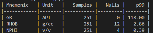
from tabulate import tabulate

curves = [
    {"Mnemonic": "GR",   "Unit": "API",  "Samples": 251, "Nulls": 0,  "p99": 118},
    {"Mnemonic": "RHOB", "Unit": "g/cc", "Samples": 251, "Nulls": 12, "p99": 2.86},
    {"Mnemonic": "NPHI", "Unit": "v/v",  "Samples": 251, "Nulls": 4,  "p99": 0.39},
]

print(tabulate(curves, headers="keys", tablefmt="github",
               floatfmt=".2f", colalign=("left","left","right","right","right")))
When we run the above code, we get the following output containing a summary of our curves.
Whilst the above code is manually entered, we could automate the process of summarising las files by creating a custom function to which we can pass our las file into.
import lasio
import numpy as np
from tabulate import tabulate

def summarise_curves(lasfile, tablefmt="github"):
    """
    Summarise curves from a LAS file into a tabular report.

    Parameters
    ----------
    lasfile : str or lasio.LASFile
        Path to a LAS file, or an already-loaded lasio.LASFile object.
    tablefmt : str
        Table style format passed to tabulate (default: 'github').
    """
    las = lasio.read(lasfile) if isinstance(lasfile, str) else lasfile
    null = las.well.NULL.value if "NULL" in las.well else -999.25

    curves = []
    for curve in las.curves:
        data = las[curve.mnemonic]
        samples = len(data)
        nulls = np.count_nonzero(data == null)
        valid = data[data != null]
        p99 = np.percentile(valid, 99) if len(valid) > 0 else np.nan

        curves.append({
            "Mnemonic": curve.mnemonic,
            "Unit": curve.unit,
            "Samples": samples,
            "Nulls": nulls,
            "p99": p99,
        })

    return tabulate(curves,
                    headers="keys",
                    tablefmt=tablefmt,
                    floatfmt=".2f",
                    colalign=("left","left","right","right","right"))

# Example usage
print(summarise_curves("Random-02.las"))
tabulate also comes with a range of built-in table styles, which can make your output table more visually appealing and readable.
With just a small change, you can output the same data as a plain text table, a grid, or even Markdown-ready for dropping straight into a report.
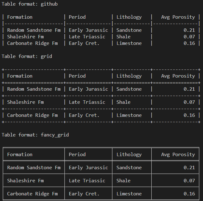
from tabulate import tabulate

formations = [
    {"Formation": "Random Sandstone Fm", "Period": "Early Jurassic", "Lithology": "Sandstone", "Avg Porosity": 0.21},
    {"Formation": "Shaleshire Fm",       "Period": "Late Triassic",  "Lithology": "Shale",     "Avg Porosity": 0.07},
    {"Formation": "Carbonate Ridge Fm",  "Period": "Early Cret.",    "Lithology": "Limestone", "Avg Porosity": 0.16},
]

for style in ["github", "grid", "fancy_grid"]:
    print(f"\nTable format: {style}\n")
    print(tabulate(formations, headers="keys", tablefmt=style, floatfmt=".2f"))
When the above code is run, we get back the following output showing the different styles.
rich
rich is a great library which allows you to fully customise the terminal output by changing text colour, displaying colour coded syntax, and creating very nice tables.
I previously wrote about this in the following article:
Bring Your Python Terminal to Life With Colour and Clarity
To install the library, we call upon the following:
pip install richAnd to get started using rich for tables, we can call upon the following code.
from rich.table import Table
from rich.console import Console
from rich import box
console = Console()
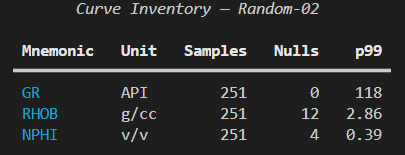
table = Table(title="Curve Inventory - Random-02", box=box.SIMPLE_HEAVY)
table.add_column("Mnemonic", style="cyan", no_wrap=True)
table.add_column("Unit", justify="center")
table.add_column("Samples", justify="right")
table.add_column("Nulls", justify="right")
table.add_column("p99", justify="right")
rows = [
("GR", "API", "251", "0", "118"),
("RHOB", "g/cc", "251", "12", "2.86"),
("NPHI", "v/v", "251", "4", "0.39"),
]
for r in rows:
table.add_row(*r)
console.print(table)We can see that we first need to create a Console() object, which allows us to have complete control over the formatting of text within the terminal.
Next, we create a Table() object, and we can simply add columns to the table by calling upon table.add_column()
Once we have the columns of our table setup, we can begin populating a list of our data and then adding the rows iteratively to the table by calling upon table.add_row()
When we run the app, we can get the following output.
Not only does rich allow us to display tables, it can also be handy for displaying tree and hierarchy structures.
For example, we may have a series of well log curves in several wells, and we have built up a dictionary containing that information. We can then create a Tree() instance and then loop over the contents of the dictionary to add it to the tree.
from rich.console import Console
from rich.tree import Tree

console = Console()

project = {
    "Random-01": ["GR", "RHOB", "NPHI", "DT"],
    "Random-02": ["GR", "RHOB", "NPHI", "DT", "PEF"],
    "Random-03": ["GR", "RHOB", "DT"],
}

root = Tree("[bold]Project: West Random Basin[/]")
for well, curves in project.items():
    well_node = root.add(f"[cyan]{well}[/] ([green]{len(curves)} curves[/])")
    for c in curves:
        well_node.add(f"[white]{c}[/]")

console.print(root)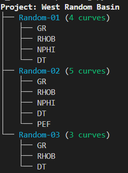
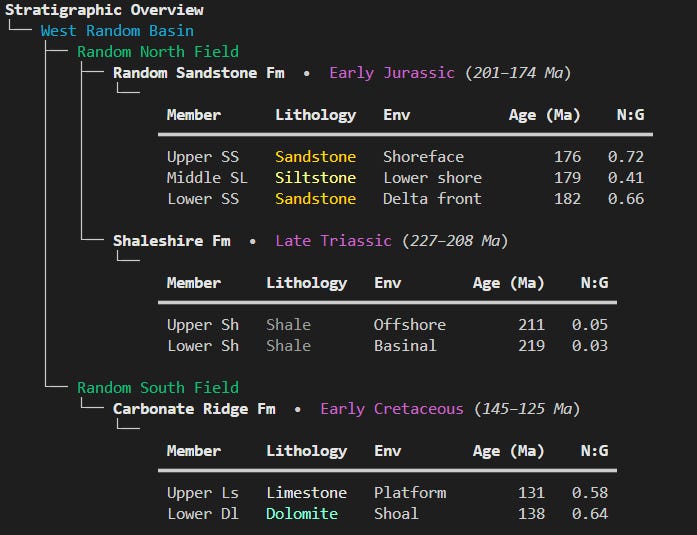
We can also get more complex with tables and trees, and combine both of them to give a nice output for a Stratigraphic Overview
from rich.console import Console
from rich.tree import Tree
from rich.table import Table
from rich import box

console = Console()

stratigraphy = {
    "West Random Basin": {
        "Random North Field": {
            "Random Sandstone Fm": {
                "meta": {"period": "Early Jurassic", "age_Ma": "201–174"},
                "members": [
                    {"Member": "Upper SS",  "Lithology": "[gold1]Sandstone[/]", "Env": "Shoreface",    "Age (Ma)": 176, "N:G": 0.72},
                    {"Member": "Middle SL", "Lithology": "[khaki1]Siltstone[/]", "Env": "Lower shore", "Age (Ma)": 179, "N:G": 0.41},
                    {"Member": "Lower SS",  "Lithology": "[gold1]Sandstone[/]", "Env": "Delta front", "Age (Ma)": 182, "N:G": 0.66},
                ],
            },
            "Shaleshire Fm": {
                "meta": {"period": "Late Triassic", "age_Ma": "227–208"},
                "members": [
                    {"Member": "Upper Sh",  "Lithology": "[grey62]Shale[/]",     "Env": "Offshore",    "Age (Ma)": 211, "N:G": 0.05},
                    {"Member": "Lower Sh",  "Lithology": "[grey62]Shale[/]",     "Env": "Basinal",     "Age (Ma)": 219, "N:G": 0.03},
                ],
            },
        },
        "Random South Field": {
            "Carbonate Ridge Fm": {
                "meta": {"period": "Early Cretaceous", "age_Ma": "145–125"},
                "members": [
                    {"Member": "Upper Ls",  "Lithology": "[bright_white]Limestone[/]", "Env": "Platform", "Age (Ma)": 131, "N:G": 0.58},
                    {"Member": "Lower Dl",  "Lithology": "[aquamarine1]Dolomite[/]",   "Env": "Shoal",    "Age (Ma)": 138, "N:G": 0.64},
                ],
            }
        }
    }
}

root = Tree("[bold]Stratigraphic Overview[/]")

for basin, fields in stratigraphy.items():
    basin_node = root.add(f"[cyan]{basin}[/]")
    for field, formations in fields.items():
        field_node = basin_node.add(f"[green]{field}[/]")
        for fm_name, fm_data in formations.items():
            period = fm_data["meta"]["period"]
            age_band = fm_data["meta"]["age_Ma"]
            fm_node = field_node.add(f"[bold white]{fm_name}[/]  •  [magenta]{period}[/] ([italic]{age_band} Ma[/])")

            # Mini table per formation
            tbl = Table(box=box.SIMPLE_HEAVY, show_header=True, header_style="bold", expand=False, padding=(0,1))
            tbl.add_column("Member")
            tbl.add_column("Lithology")
            tbl.add_column("Env")
            tbl.add_column("Age (Ma)", justify="right")
            tbl.add_column("N:G", justify="right")

            for m in fm_data["members"]:
                tbl.add_row(
                    m["Member"],
                    m["Lithology"],
                    m["Env"],
                    f"{m['Age (Ma)']}",
                    f"{m['N:G']:.2f}",
                )

            fm_node.add(tbl)

console.print(root)
When we run the above code, we get back the following output, which is very readable and would be a great addition to a console based reporting app.
Summary
Working with tables is an everyday part of geoscience and petrophysics. Whether it’s curve metadata, formation summaries, or QC checks, clear tabular output makes life easier.
The standard print() function will get you the raw data, but libraries like pprint, tabulate, and rich let you structure that data so it’s readable, informative, and even a little stylish.
If you’re building console-based Python tools for yourself or your colleagues, taking the extra step to ensure the format your output is readable can go a long way to making results quicker to scan and easier to trust.