
3 Python Charts You’re Probably Not Using (But Should Be)
Three underused chart types and when to reach for them when working with well log data


When it comes to data visualisation in Python, most of us reach for the same handful of chart types. Scatter plots, histograms, bar charts, and line plots cover a lot of ground, but sometimes the data has a story that these familiar charts struggle to tell clearly.
If you have followed me for some time, you will know that I enjoy tinkering with data visualisations. Often taking them for boring and bland to useful and much better looking.
In this article, I want to introduce three chart types that I think deserve more attention. Each one solves a specific visualisation problem better than the defaults we tend to rely on. We will work through each chart using both synthetic data, showing the “before” with a standard chart and the “after” with the alternative.
The three charts we will cover are:
Bump Charts for tracking how rankings change over time
Ridgeline Plots for comparing distributions across multiple groups
Beeswarm Plots for revealing individual data points that summary statistics hide
Setting Up Our Environment
Before we get started, we first need to install the libraries we’ll be using.
You will likely have pandas, matplotlib and seaborn, but bumplot and joypy are likely to be new libraries to you. You can install them in the terminal like so:
pip install bumplot joypy seaborn matplotlib pandas numpyimport matplotlib.pyplot as plt
import numpy as np
import pandas as pd
import seaborn as sns1. Bump Charts: Tracking Rank Changes Over Time
The Problem
Imagine you have data showing how different items are ranked across several time periods. You might reach for a standard line plot, but when the lines cross over each other, things get messy quickly. It becomes hard to follow any individual line and the chart ends up looking like a plate of spaghetti.
Bump charts solve this by focusing specifically on rank position rather than raw values. The smooth Bézier curves make it easy to follow each item as it moves up and down the rankings.
Synthetic Data Example
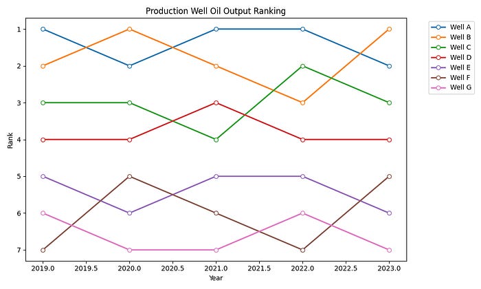
For this example, we will track how a set of wells have ranked against each other over five years, perhaps by production output or any other metric where relative position matters. Each well is assigned a rank per year, with rank 1 being the top performing well.
years = [2019, 2020, 2021, 2022, 2023]

measurements = {
    ‘Well A’: [1, 2, 1, 1, 2],
    ‘Well B’: [2, 1, 2, 3, 1],
    ‘Well C’: [3, 3, 4, 2, 3],
    ‘Well D’: [4, 4, 3, 4, 4],
    ‘Well E’: [5, 6, 5, 5, 6],
    ‘Well F’: [7, 5, 6, 7, 5],
    ‘Well G’: [6, 7, 7, 6, 7],
}
The Standard Line Plot (Before)
The instinct here is to reach for a line plot.
fig, ax = plt.subplots(figsize=(10, 6))
for measurement, ranks in measurements.items():
    ax.plot(years, ranks, marker=’o’, label=measurement,
            markerfacecolor=’white’, linewidth=2)
ax.set_ylabel(’Rank’)
ax.set_xlabel(’Year’)
ax.set_title(’Well Ranking Over Time’)
ax.invert_yaxis()
ax.legend(bbox_to_anchor=(1.05, 1), loc=’upper left’)
ax.set_yticks(range(1, 8))
plt.tight_layout()
plt.show()
It works, but you will notice how quickly the crossing lines become difficult to follow. By 2020, when Well A and Well B swap positions, and again in 2021 when Well C drops back, tracking any individual well requires real effort.
The Bump Chart (After)
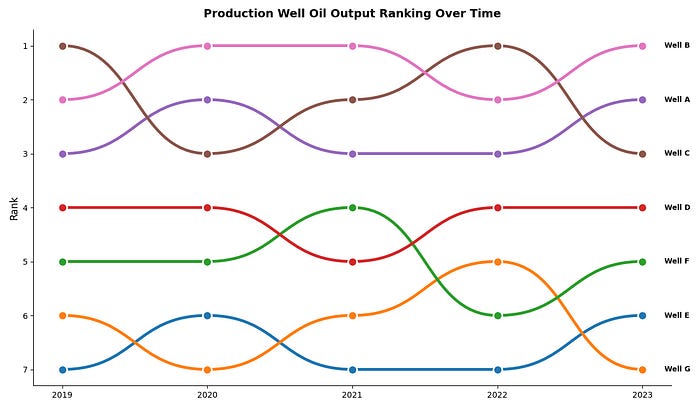
The bump chart below uses the same data, but replaces straight line segments with smooth Bézier curves and labels each line directly at the right-hand edge.
One thing to note: bumplot expects the data in a specific shape — ranked values in a DataFrame with the time axis as the index. The rank() call below handles the conversion if your raw data is in value form rather than rank form.
from bumplot import bumplot

df_bump = pd.DataFrame(measurements, index=years)
df_bump.index.name = ‘Year’
df_ranked = df_bump.rank(axis=1, method=’min’).astype(int)

fig, ax = plt.subplots(figsize=(12, 7))
bumplot(
    x=’Year’,
    y_columns=list(measurements.keys()),
    data=df_ranked.reset_index(),
    curve_force=0.5,
    plot_kwargs={’lw’: 3.5},
    scatter_kwargs={’s’: 120, ‘ec’: ‘white’, ‘lw’: 2, ‘zorder’: 5},
)
ax.set_yticks(range(1, 8))
ax.set_ylabel(’Rank’, fontsize=12)
ax.set_xlabel(’‘)
ax.set_title(’Well Ranking Over Time’,
             fontsize=14, fontweight=’bold’, pad=15)
for measurement, ranks in measurements.items():
    ax.text(2023.15, ranks[-1], measurement,
            va=’center’, fontsize=9, fontweight=’bold’)
ax.spines[[’top’, ‘right’]].set_visible(False)
ax.legend().set_visible(False)
plt.tight_layout()
plt.show()
You can now follow any individual well across all five years without needing to cross-reference a legend. The back-and-forth battle between Well A and Well B at the top of the rankings is immediately readable.
When to Use Bump Charts
Bump charts work best when you care about relative position rather than absolute values. They are ideal for tracking league tables, survey preference rankings, or in our case, how the production rate of different wells have shifted across fields or over time. If you have more than about 10 items, the chart can get busy, so consider focusing on the top performers.
2. Ridgeline Plots: Comparing Distributions at a Glance
The Problem
Comparing the distribution of a measurement across multiple groups is something we do constantly in petrophysics. The typical approach is to plot overlapping histograms, but once you go beyond two or three groups, the overlap makes the chart unreadable.
Ridgeline plots (sometimes called joy plots, after the Joy Division album cover) stack partially overlapping density curves vertically. Each group gets its own row, but they share the same horizontal axis, making comparison effortless.
Synthetic Data Example
We’ll simulate gamma ray readings across six different formations, each with a random and, different mean and spread. This mirrors the kind of data you would encounter when characterising lithology within a single well.
np.random.seed(42)

formations = {
    ‘Balder Fm’: np.random.normal(loc=45, scale=12, size=500),
    ‘Sele Fm’: np.random.normal(loc=85, scale=15, size=500),
    ‘Lista Fm’: np.random.normal(loc=70, scale=20, size=500),
    ‘Tor Fm’: np.random.normal(loc=25, scale=8, size=500),
    ‘Draupne Fm’: np.random.normal(loc=110, scale=18, size=500),
    ‘Heather Fm’: np.random.normal(loc=65, scale=22, size=500),
}
df_ridge = pd.DataFrame({
    ‘GR’: np.concatenate(list(formations.values())),
    ‘Formation’: np.concatenate([[name] * len(values)
                                  for name, values in formations.items()])
})
Overlapping Histograms (Before)
fig, ax = plt.subplots(figsize=(10, 6))

for formation in formations:
    subset = df_ridge[df_ridge[’Formation’] == formation]
    ax.hist(subset[’GR’], bins=50, alpha=0.4, label=formation)
ax.set_xlabel(’Gamma Ray (API)’)
ax.set_ylabel(’Frequency’)
ax.set_title(’Gamma Ray Distribution by Formation’)
ax.legend()
plt.tight_layout()
plt.show()
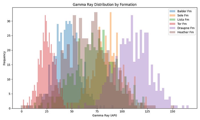
With six formations, the overlapping histogram quickly becomes a tangle. You can pick out the extremes: Tor Fm on the low end, Draupne Fm on the high end, but anything in the middle is lost. Reducing the alpha helps slightly but doesn’t solve the fundamental problem.
The Ridgeline Plot (After)
The ridgeline plot below gives each formation its own row while keeping the x-axis shared. The overlap parameter controls how much each row bleeds into the one above — a value of 0.4 gives a good balance between compactness and readability. The viridis colormap here helps visually separate each formation, though you can use any sequential or categorical palette depending on your preference.
import joypy

fig, axes = joypy.joyplot(
    df_ridge,
    by=’Formation’,
    column=’GR’,
    figsize=(10, 7),
    colormap=plt.cm.viridis,
    alpha=0.7,
    linewidth=1.2,
    overlap=0.4,
    x_range=(-20, 170),
)
plt.xlabel(’Gamma Ray (API)’, fontsize=12)
plt.title(’Gamma Ray Distribution by Formation’,
          fontsize=14, fontweight=’bold’, y=1.02)
plt.tight_layout()
plt.show()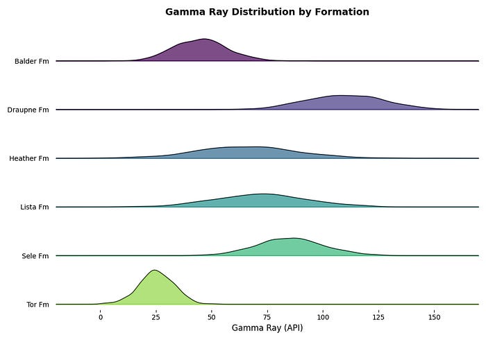
When to Use Ridgeline Plots
Ridgeline plots shine when you have six or more groups and want to compare their distributions side by side. They are compact, visually distinctive, and scale well.
If you’re enjoying this, I’ve written a piece on Substack covering four simple changes that improve any chart, regardless of type. Link at the end.
3. Beeswarm Plots: Showing Every Data Point
The Problem
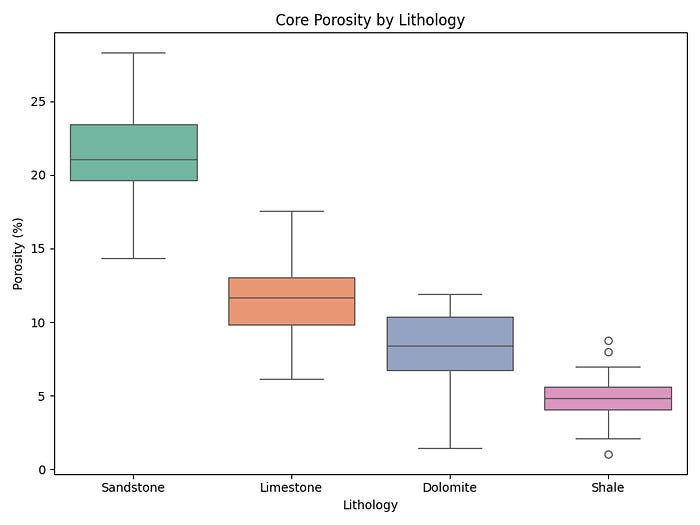
Box plots are a staple of data exploration. They give you the median, quartiles, and outliers in a compact form. But, they hide the actual data. A box plot with 15 data points looks identical to one with 1,500, and you lose all sense of where individual measurements cluster.
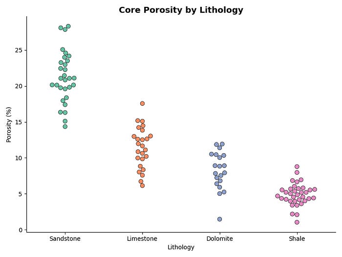
Beeswarm plots display every individual data point, adjusting their position so they do not overlap. The result looks like a swarm of bees, and it gives you both the distribution shape and the raw data in a single view.
Synthetic Data Example
We’ll simulate core porosity measurements across four lithologies. Core data is a classic case where sample sizes are small and every data point carries real weight. Here you want to see each measurement individually, not have it absorbed into a summary statistic.
np.random.seed(42)
lithologies = {
    ‘Sandstone’: np.random.normal(loc=22, scale=4, size=30),
    ‘Limestone’: np.random.normal(loc=12, scale=3, size=25),
    ‘Dolomite’: np.random.normal(loc=8, scale=2.5, size=20),
    ‘Shale’: np.random.normal(loc=5, scale=2, size=35),
}

df_swarm = pd.DataFrame({
    ‘Porosity (%)’: np.concatenate(list(lithologies.values())),
    ‘Lithology’: np.concatenate([[name] * len(values)
                                  for name, values in lithologies.items()])
})

df_swarm[’Porosity (%)’] = df_swarm[’Porosity (%)’].clip(lower=0, upper=35)
The Box Plot (Before)
fig, ax = plt.subplots(figsize=(8, 6))
sns.boxplot(x=’Lithology’, y=’Porosity (%)’, data=df_swarm,
            palette=’Set2’, ax=ax)
ax.set_title(’Core Porosity by Lithology’)
plt.tight_layout()
plt.show()
The box plot below is perfectly readable, but notice what it doesn’t tell you. Are the sandstone measurements clustered tightly around the median, or spread across the full interquartile range? Is there a bimodal cluster hiding in the shale data? The box plot can’t answer those questions.
The Beeswarm Plot (After)
fig, ax = plt.subplots(figsize=(8, 6))
sns.swarmplot(x=’Lithology’, y=’Porosity (%)’, data=df_swarm,
              palette=’Set2’, size=7, edgecolor=’black’,
              linewidth=0.5, ax=ax)
ax.set_title(’Core Porosity by Lithology’,
             fontsize=14, fontweight=’bold’)
ax.spines[[’top’, ‘right’]].set_visible(False)
plt.tight_layout()
plt.show()
With the beeswarm, each of the 110 data points is visible. You can immediately see that the sandstone measurements are reasonably spread across the range, while the dolomite and shale measurements cluster tightly. That’s information the box plot was hiding.
The size parameter controls point diameter. 7 works well for datasets in this range, but you may want to reduce it if you have more points per group to avoid the swarm getting too wide.
Combining Both: The Best of Both Worlds
If you want the summary statistics of a box plot and the transparency of a beeswarm in one view, you can layer them directly. The key is reducing the box plot’s alpha so it reads as background context rather than competing for attention. The median line is kept at full opacity.
fig, ax = plt.subplots(figsize=(8, 6))

sns.boxplot(x=’Lithology’, y=’Porosity (%)’, data=df_swarm,
            palette=’Set2’, ax=ax,
            boxprops=dict(alpha=0.3),
            whiskerprops=dict(alpha=0.5),
            capprops=dict(alpha=0.5),
            medianprops=dict(color=’black’, linewidth=2))
sns.swarmplot(x=’Lithology’, y=’Porosity (%)’, data=df_swarm,
              palette=’Set2’, size=6, edgecolor=’black’,
              linewidth=0.5, ax=ax)
ax.set_title(’Core Porosity by Lithology\\n(Box Plot + Beeswarm Overlay)’,
             fontsize=14, fontweight=’bold’)
ax.spines[[’top’, ‘right’]].set_visible(False)
plt.tight_layout()
plt.show()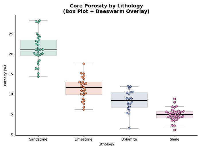
When to Use Beeswarm Plots
Beeswarm plots work best when your sample sizes are small to moderate (roughly up to 200 points per group). They are perfect for laboratory data, core measurements, or any situation where showing every data point adds value.
Summary
Bump charts make rank changes easy to follow, turning tangled line plots into smooth, readable visualisations. The bumplot library makes them straightforward to create in Python.
Ridgeline plots compress multiple distribution comparisons into a compact, visually striking format. They are particularly useful in petrophysics where we regularly need to compare log responses across formations or wells.
Beeswarm plots reveal the individual data points that box plots hide. When sample sizes are small and every measurement counts, showing the raw data alongside summary statistics gives a far more honest picture.
If you enjoyed this article, you might also like one I published on Substack looking at four simple ways to instantly improve your data visualisations. It covers practical changes you can make to any chart, regardless of the type.
You can read it here: 4 Easy Ways to Instantly Improve Your Data Visualisations